peer critique

IMAG1011

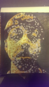
This color depth collage works because the artist used shades that make the portrait appear more realistic.    The color value scale can be seen in the yellow used in the areas of the nose and expanded to the rest of the portrait.  You can also see the sharp contrast in the chin area that makes the portrait more deep.  The contrast of the background enhances the outline of the face boundaries and was effectively done.

self critique

20150508_020307-1

The project worked because I used complementary colors such as the orange and blue in different tones, helping to make the portrait seem more realistic.  I also used shades to make some sections of the portrait appear lighter and darker.  In addition, the portrait is approximate symmetrical and this can be evidenced by seeing the similarities but still having differences as well.  The area that can be improved is the forehead and this can be accomplished by changing the contrast in the blues more gradually.