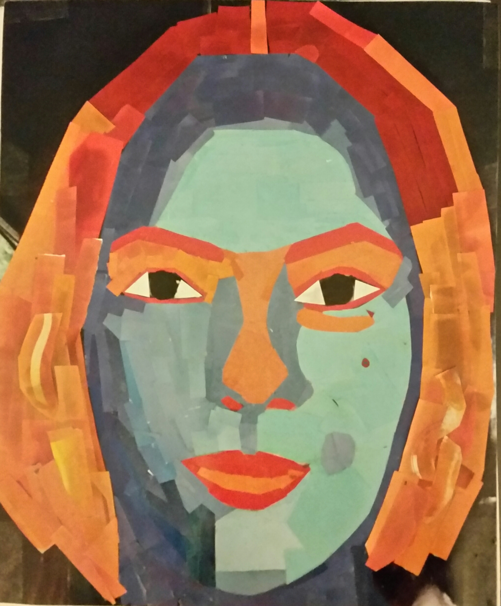
The project worked because I used complementary colors such as the orange and blue in different tones, helping to make the portrait seem more realistic. I also used shades to make some sections of the portrait appear lighter and darker. In addition, the portrait is approximate symmetrical and this can be evidenced by seeing the similarities but still having differences as well. The area that can be improved is the forehead and this can be accomplished by changing the contrast in the blues more gradually.
